


A few weeks ago, I got a message from Anne Curtis about possibly doing a poster for her upcoming movie Sid & Aya (Not A Love Story) co-starring Dingdong Dantes. I've been doing design for Anne since 2011, from movie and concert posters, and album art so taking this project was a no-brainer duh.
I saw the teaser during Never Not Love You and the first thing I noticed was the cinematography. It was so vibrant and alive. Another thing I liked about it was that even if it didn't say too much about the characters, you could tell something was up with these two. One of my biggest pet peeves about trailers for local rom-coms is when they say NOTHING about the plot or characters and it's literally just a montage of kilig faces ending with a cutesy one-liner or a hugot line. This wasn't like that, it served the purpose of a teaser wherein just enough is revealed to make you want to know more. (Also the song sounded nice! Not your typical power ballad.)

The first teaser for the movie.
A week later I was down with a bad case of bronchitis when I got a call (actually 7 missed calls) from Ms. June Rufino of Viva saying it was urgent. She asked if I could do the poster and I was like SURE! She gave some details like the only material I had to work with were stills from the trailer. And then right before she hung up she goes "Pasensya na, I need this in 2 days ha!" WAIT, WHAT? I don't think I've agreed to doing anything with this deadline before and with material I haven't even seen, while being sick as a dog, BUT movie posters are everything, the movie actually looks legit good, and I'm always up for a challenge!
Later that night they released the official trailer which gave more away so it was easier to get a vibe (and made me more nervous because if the trailer is out, the poster should technically be out too!) Anne then put me in touch with the director and writer, Direk Irene Villamor, and through a quick Viber chat, they gave me a little more (non-spoiler) details about the movie.

The full trailer of the movie. (I changed the thumbnail for this trailer ‘cos this looked cooler)
My initial idea was to do a collage, something which is usually a go-to when I'm provided with a lot of stills to work with. For some reason the first word that came to mind after the trailer was MANIC. The movie looked vivid, Anne looks like she's playing like 5 different characters, scenes in neon drenched Tokyo bars, probably the delirious world of an insomniac. Another idea was to find a good still and just play around with cropping, color treatment, and typography. This would be simple and minimal but it would all depend on getting that ONE PERFECT STILL that can capture the mood of the movie.
After going through all the stills, it became apparent that there was one shot that could work as a stand-alone still. It was the clearest screenshot we could find of Sid and Aya in the Shibuya Scramble. I liked how you could kind of clearly see them but it all still felt chaotic and messy and there was so much movement around them. Granted it isn't the most flattering faces of Anne and Dingdong but I think it fit the tone! I also really liked the idea of having a dark, pitch black heavy poster for a rom-com. Here's the original unedited still and what I came up with after cloning out some buildings, cropping and layout.

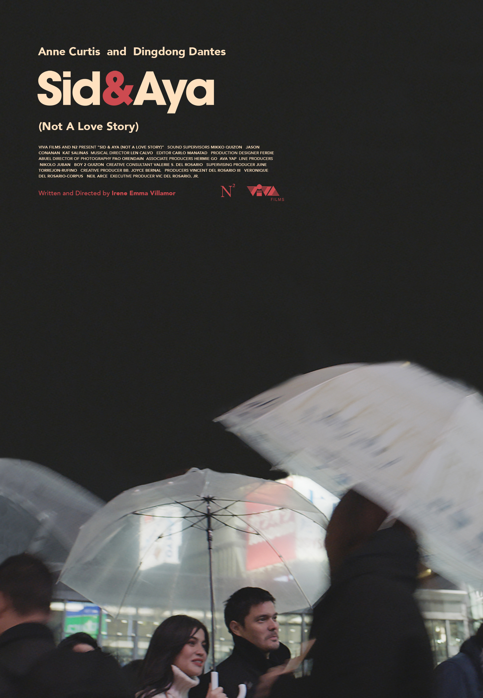
Not the best faces of Anne and Dingdong and a little too dark but I was really into this
While Anne, Dingdong and Direk Irene all liked this version, we agreed that it was better to explore another direction that would be more attractive and relatable to the Pinoy audience.
The second direction was to do a collage of images that would mix detail shots, close-ups, and hero images of both leads. This was an easier way of telling a story since it's almost like showing a storyboard on a poster but the possible approaches were overwhelming. There was the equal sized boxes collage (similar to the brilliant Tree of Life poster), there was the True Detective style overlays on silhouettes, and even some Saul Bass-inspired ideas (of course). A scrapbook-y one also crossed my mind but the vibe of the movie felt like it needed a cleaner collage style. I tried a bunch of styles, some were more successful than others.

This looked a little too much like the Tree of Life poster
I sent this version to Direk Irene and while she liked it, she requested to do an option with the silhouette of Sid's head filled with Aya's images. I initially sent her similar styled collages in a moodboard but was hesitant to even try it because of lack of material to pull it off. To make something like this work, we needed a good profile shot of Dingdong, preferably in a studio with white background with precise lighting and contrast. Obviously, we didn't have that. Lol. So back to the drawing board (or the STILLS.RAR folder) I went and after looking through hundreds of them again, found this one image. The profile looked nice, the lighting on the face kind of worked but it was way too tiny and dark. Let's see what Photoshop has up his sleeve!

Added contrast and brightened the original image to make Dingdong's profile more prominent


YES. It worked? I mean the quality of the image isn't as good and sharp as the rest, but I think aesthetically as a whole it does the job! So I finally did a box collage with Aya and little details like the clock, Sid and Aya's sillhouettes looking at each other but not aligned and whatnot. Overlaid them on the profile and phew, thank god it looked good. A few studies later, we decided to remove some boxes to add to that feeling of Sid being empty and almost delirious. Here's the final version with the text layout and credits!

Thanks to Anne and Direk Irene for trusting me with this project, letting me play around, and bouncing off some ideas in this whirlwind process (and insisting to try this style of collage haha)! Looking forward to seeing the finished film when it comes out in cinemas on May 30!
PS I have no idea what the deal with Aya is! Some people online are reading into the hidden meaning of the poster like I know something haha, we'll all find out at the same time.