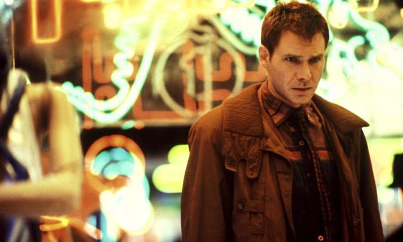
Not gonna lie, the first time I saw Blade Runner was last April at a late-night screening at Cinema Nova. I know a movie lover like me should've seen it earlier, I think I even own a Blu-ray of it but for some reason, I never got around to watching it. I found the movie to be pretty good but could imagine how mind-blowing it could've been when it was first released. The characters, the set-pieces, the world building, and the technicals still hold up to this day!
The Monday after seeing it, the brief at Shillington was to make a desktop wallpaper using Photoshop collage. Still thinking about the movie, I ended up making some key art for it. It's a typical collage but I used some solid color overlays and Helvetica to make it feel more current. Those little robot puppets really freaked me out so I had to put them in there somewhere.
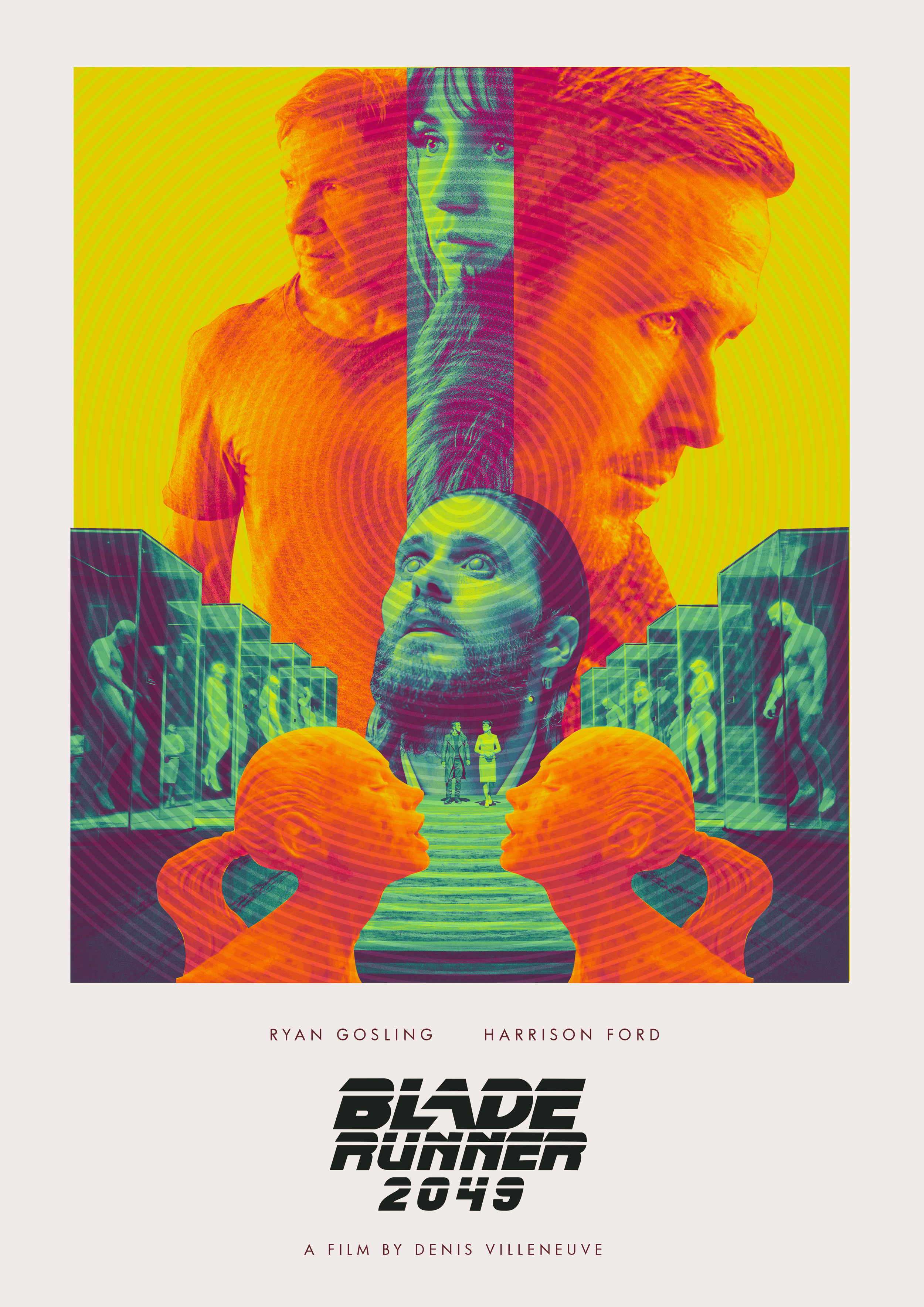
A few weeks ago, I saw a Facebook ad about a Creative Invite from Talenthouse to design an alternate poster for the sequel, Blade Runner 2049. The film, directed by future Oscar winner Denis Villeneuve and starring Ryan Gosling and Harrison Ford, has been one of my most anticipated movies of the year (Even before having seen the original, just because I'm a sucker for anything Villenueve makes. Plus Roger Deakins behind the cameras!). The judge was none other than the director of the original Ridley Scott and there was a cash prize as well. I've also been trying to do more personal work lately so it was a no-brainer to make one for this. (Plus you have to take any chance to get Ridley Scott to see your work duh!)
Real talk. I'm not an illustrator and I know the world of alternate movie posters is mostly for illustrators. I'm currently trying to figure out a style of making them by using existing stills, screencaps, stock imagery and typography (a "skill" honed at Rogue when I'd have to make editorial collages for film reviews during my early days). So here's what I came up and how it got there!
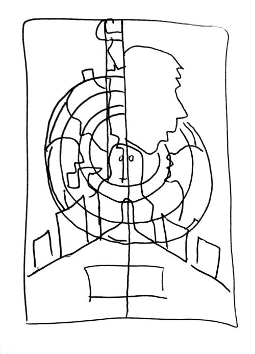
First I gathered some screencaps and publicity stills for the film to see what shapes and shots I can work with. I chose the most graphic looking ones and made a rough sketch of how to compose them all together. I then made a collage in Photoshop to match the sketch and started tweaking the sizing and positions of the characters.
I am the worst at thumbnails
Getting there but the colors were all off
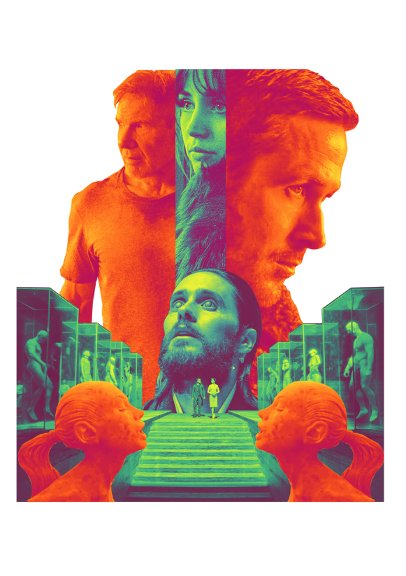
When I got the right balance and composition, I figured it was best to do image treatments to make them all look similar. The current marketing materials for the film uses a lot of blues and oranges and I liked how they looked. Gradient maps were my best friend, as well as some additional retouching techniques and color correction.
Finally got a palette I was happy with
Laid out like a classic 70s poster
After deciding on a color treatment I had to figure out how to actually lay out the poster. I had first envisioned it to be a floating heads type collage which kind of worked but I really wanted to push it further. I made an option where it's laid out like a 70s movie poster but the image and treatment didn't really fit that style.
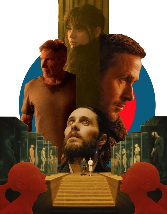
Then I remembered some modernist posters by Joseph Müller-Brockmann and Saul Bass and liked how they used solid shapes in them. I'm also a sucker for white space so I figured maybe mixing in those elements with this vibrant collage would give the piece a little more tension and breathing room. The original was all about eyeballs (they used it to tell which characters were human and which ones were replicants) so I thought of using circles as a primary shape. I changed the color palette a little to make it colder as well. The blank space occupied by the shirt of Deckard also bugged me so I added another silhouette image to finish the thing off. TA-DA! Here's the final piece!
PS Click here to see the winners of the contest! So many Pinoys!


